Sherwin-Williams Agreeable Gray vs Benjamin Moore Revere Pewter: A Tampa Painter's Take After 25 Years
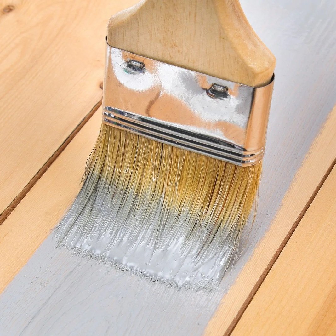
Brush applying soft gray paint on wood surface, comparing Agreeable Gray and Revere Pewter for warm Tampa interior spaces.
I get this one all the time. A homeowner standing in front of a builder-grade beige wall, with two greige sample chips taped up — SW Agreeable Gray on the left, BM Revere Pewter on the right — and they look almost identical in the showroom. They're not. On a wall, in a Tampa Bay home, under Florida sun, they behave very differently. And the wrong pick on the wrong wall is the kind of mistake homeowners live with for ten years before they finally repaint.
I'm Mark Savino. I've been painting houses across Tampa Bay for more than 25 years. We've put Agreeable Gray and Revere Pewter on hundreds of walls — Carrollwood new builds, Hyde Park bungalows, Belleair coastal homes, Westchase open-concept floor plans. Here's what actually happens to each color on real Tampa walls.
The Short Answer
For most Tampa Bay homes — especially newer open-floor-plan builds with high ceilings and lots of natural light — Agreeable Gray is the safer pick. Higher LRV, more consistent across changing light through the day, fewer surprises across an open plan.
For specific Tampa homes — older neighborhoods (Hyde Park, Tampa Heights, Davis Islands) with traditional millwork and warm wood floors — Revere Pewter earns its place in single rooms with strong south-facing light. As a whole-home choice in modern Tampa construction? It's a riskier call.
The difference between these two colors comes down to three things: LRV (how light or dark each reads), undertone (Agreeable Gray pulls warm-tan; Revere Pewter pulls warm-green), and how each responds to Florida light. We'll walk through all three.
Why Greige at All?
Greige — gray plus beige — became the dominant interior color about a decade ago and hasn't left. The reason is simple: it works as a neutral on warm-tone floors (wood, LVP, travertine) and on cool-tone floors (gray tile, polished concrete). Most Tampa Bay homes have a mix of flooring types across the open floor plan, and greige is the rare color that doesn't clash with either.
Two colors dominate the greige category: Sherwin-Williams Agreeable Gray (SW 7029) and Benjamin Moore Revere Pewter (HC-172). They're not the only choices, but they're the two homeowners ask about most often. Here's how they actually compare.
The Data, Side-by-Side
| Spec | SW Agreeable Gray (SW 7029) | BM Revere Pewter (HC-172) |
|---|---|---|
| Color family | Neutral / greige | Historical Collection / greige |
| LRV (Light Reflectance Value) | ~60 | ~55 |
| Hex (approximate) | #D1CBC1 | #CCC4B8 |
| RGB (approximate) | 209, 203, 193 | 204, 196, 184 |
| Primary undertone | Warm tan / taupe | Warm green / olive |
| Reads in north light | Cools slightly, can read muddy in weak light | Green comes forward — can read sage |
| Reads in south light | Soft warm greige, consistent | Warms to putty-taupe, very flattering |
| Best room types | Open plans, light-starved rooms, whole-home | Single rooms, defined architecture, traditional |
| Trim pairings (popular) | SW Pure White, SW Alabaster, BM White Dove | BM White Dove, Simply White, Chantilly Lace |
| Where it struggles | Very cool light (faint violet cast), north rooms with weak light | Cool flooring, cool granite, north-facing rooms, open plans with mixed light |
A quick note on LRV before we go further: Light Reflectance Value is a 0-to-100 scale where 0 is absolute black and 100 is absolute white. The five-point gap between LRV 60 and LRV 55 sounds small, but reads big on a wall — Agreeable Gray reflects noticeably more light back into the room. In Tampa Bay, homes with high ceilings and tile floors, where that extra light bounces around, change how the whole space feels. Revere Pewter pulls the room tighter and more grounded; Agreeable Gray opens it up.
Where Agreeable Gray Earns the Spot
Open floor plans. This is the strongest case for Agreeable Gray in Tampa. Most newer Tampa Bay builds — Carrollwood, Westchase, Lutz, Wesley Chapel — have an open kitchen-living-dining flow with mixed light: a south-facing wall in the great room, a north-facing wall in the kitchen, sometimes a west-facing slider to the lanai. Agreeable Gray reads consistently across all of those zones. Revere Pewter shifts noticeably from zone to zone, and the green undertone shows up in one corner and hides in another. On an open plan, that inconsistency is a problem.
Light-starved rooms. The LRV 60 works well in rooms that don't get strong direct light — a north-facing master bedroom, a guest bedroom over the garage, and a powder room with no windows. Agreeable Gray gives those rooms breathing room. Revere Pewter pulls them tighter and can feel heavy.
Pairing with warm wood-look LVP and travertine. This is the dominant flooring in newer Tampa builds — wood-look LVP plank in the main living areas, travertine or tile in the bath and laundry. Agreeable Gray's warm tan undertone harmonizes with both. The walls and floor feel like they belong to the same palette.
Resale-friendly choice. For homeowners planning to sell within five years, Agreeable Gray is the lowest-risk neutral. It reads as "fresh and current" without being trendy. Revere Pewter is also liked but has more personality, which means more chance of clashing with a buyer's furniture or taste.
Exterior trim and accents. Under the intense Florida sun, Agreeable Gray reads almost white on exterior trim. Several Tampa contractors recommend it for that reason on stucco homes with darker accent colors. Revere Pewter is too mid-tone for most exterior applications here — it would read olive under direct sun and clash with green landscaping.
Where Revere Pewter Earns Its Place
Older Tampa neighborhoods with traditional architecture. Homes in Hyde Park, Tampa Heights, Davis Islands, Seminole Heights, and the older parts of St. Petersburg often have crown molding, wainscoting, original hardwood floors, and rooms with strong south or west exposures. That's the architecture Revere Pewter was made for. The warm green-olive undertone reads as historical, not muddy, when paired with cream trim and warm wood floors.
Single rooms with defined design intent. A formal dining room. A library with built-in shelves. A primary bedroom in a 1920s bungalow. Revere Pewter has more presence than Agreeable Gray — designers describe it as "feels like a color, not the absence of color." When you want a room to have a mood, Revere Pewter delivers it.
Strong south-facing rooms. South light is Revere Pewter's friend. It warms the green undertone to a rich putty-taupe and brings out the depth of the color. A south-facing great room with afternoon sun and warm hardwood — Revere Pewter is a contender.
Homes with warm cream trim already in place. Revere Pewter pairs beautifully with cream and warm whites (BM White Dove, Simply White). If a homeowner already has trim in one of those, Revere Pewter is a candidate. If the existing trim is cool, stark white, skip it — the contrast will read off.
What Each One Gets Wrong
Agreeable Gray's weaknesses. In very weak indirect light (north-facing rooms with small windows, hallways with no natural light), it can read flat or slightly muddy. Designer reviewers note a faint violet/purple cast in some cool light conditions — not common, but it happens. And because it's a "safe" choice, some homeowners find it boring once it's on the walls — they wanted personality and got beige-gray.
Revere Pewter's weaknesses. The green undertone is real, and homeowners who don't expect it get caught. North-facing rooms turn sage. Cool gray tile flooring fights it. Cool stainless or chrome-heavy kitchens make the green show more. Cool white trim against Revere Pewter looks wrong — the color demands warm trim to balance it. And in an open Tampa Bay floor plan with mixed light, Revere Pewter shifts color across the space, which most homeowners read as "the paint job is bad" rather than "the color is doing what it does."
These aren't fatal flaws on either color. They're behaviors to know about before committing the whole house to one.
Two Things Most Comparisons Skip
LRV matters more than undertone for most homeowners. Color blogs spend most of their words on undertone — warm vs cool, green vs purple, taupe vs tan. That stuff is real, but for most Tampa homeowners trying to make a decision, the LRV gap (60 vs 55) drives more of the practical difference than the undertone debate. In a bright open Tampa great room, the five-point LRV gap is what they'll feel. The undertone shows up after they move in.
Sample on the actual wall in three lighting conditions before you commit. This sounds obvious, but homeowners skip it constantly. Get sample-size pints of both. Paint two-foot squares on the wall — not on white poster board, on the actual wall. Look at them at 9 AM, 1 PM, and 8 PM with the lamps on. If the color shifts dramatically and you don't like the shifts, you've got the wrong color. We do this on every job that involves a contested color choice. The fifteen dollars of sample paint saves a thousand dollars of regret.
The Florida Factor
Tampa Bay light is different from the light in the designer's photo gallery. A few specific things matter here.
The Florida sun is intense and reflective. Both colors will read lighter and a touch more washed out in Tampa than they would in Boston or Seattle. Agreeable Gray reads almost white in direct exterior Florida sun — that's why some Tampa contractors recommend it for trim. Revere Pewter's mid-tone holds up better in strong sun, but the green undertone amplifies against tropical landscaping (palm trees reflecting green light back through windows) more than in northern climates.
Pool and lanai light bleeds into the great room. Tampa Bay homes with pool cages or open lanais get reflected light bouncing in through the slider all day. That light has a slight blue-green cast from the pool water and screen mesh. Revere Pewter's green undertone can pick this up and intensify. Agreeable Gray's warm-tan undertone neutralizes it. For homes with strong pool-side light exposure, Agreeable Gray is the safer call.
The tile-to-wood transition matters. Most Tampa Bay homes have tile in the front entry and bathrooms, wood-look LVP in the main living areas. The two floor materials often have different undertones — the tile might be cool gray, the LVP might be warm wood-look. Greige walls bridge them. Agreeable Gray bridges both more reliably than Revere Pewter because of the warmer, more consistent base tone.
Humidity doesn't change the color — but mildew does. This sounds obvious, but it isn't. In Tampa bathrooms with chronic mildew issues, the wall color shifts over time as mildew gets into the paint film. Both colors are vulnerable. Use the right mildew-resistant paint (Sherwin-Williams Duration, Behr Marquee, or a specialty bath paint) regardless of color choice.
When the Customer Asks Me Which to Buy
Here's how the conversation usually goes during the color walk-through.
If a homeowner in Carrollwood is repainting an open-plan home with builder-grade wood-look LVP, tile entry, white shaker cabinets, and a strong south-facing great room — we're recommending Agreeable Gray. The consistency across the open plan, the warm bridge between flooring types, and the higher LRV all point this direction.
If a homeowner in Hyde Park has a 1920s bungalow with original hardwood floors, deep cream trim, crown molding, and a south-facing living room — we're recommending Revere Pewter. The architecture and the light earn the depth.
If somebody in Westchase wants a "safe whole-home neutral that won't go out of style for ten years" — Agreeable Gray, on every wall except accent.
If somebody in Belleair wants a specific room — say, a formal dining room with paneled walls and chandelier lighting — to feel rich and warm — Revere Pewter, that one room only.
If somebody's flipping a duplex in Pinellas Park, where the new tenant matters more than personality — Agreeable Gray. Lowest-risk pick across taste.
That's how I actually decide. The colors are both good. The fit to the home is what makes one right and the other wrong.
What the Data Won't Tell You
I want to be honest about what's behind these recommendations.
LRV and hex values come from the manufacturer’s color pages. The undertone descriptions come from a consistent body of designer reviewer commentary (Kylie M Interiors, The Color Concierge, Suite Minded, By Design, and Viz) plus 25 years of seeing how each color actually behaves on Tampa walls. There isn't a single lab test that proves "Revere Pewter has X percent green undertone." It's pattern recognition from many jobs.
The "Tampa Bay homeowners prefer Agreeable Gray" framing in this article reflects what I've seen on jobs and what other Tampa painters publicly report on their blogs. It isn't a survey number. The directional pattern is real; the specific percentage isn't something I'd put in print.
Both Sherwin-Williams and Benjamin Moore occasionally tweak their formulations. The Agreeable Gray in the can today isn't perfectly identical to Agreeable Gray from 2015. Same for Revere Pewter. The color chip stays the same; tinting accuracy varies a little from batch to batch. For a critical color match, always order a sample from the specific store and base you'll use for the job.
Frequently Asked Questions
It's greige — gray with warm tan undertones. In most Tampa Bay lighting, it reads slightly more beige than gray. That's what makes it pair so well with warm wood floors.
Warm green-olive. In south light, it reads as putty or taupe; in north light, the green comes forward, and it can read sage. This is the most-discussed characteristic of the color in designer reviews.
You can, but you should expect the green to show. If you want to avoid that, pick a color with less green in the undertone — Agreeable Gray, BM Edgecomb Gray, SW Accessible Beige, or SW Repose Gray.
For Agreeable Gray: SW Pure White, SW Alabaster, or BM White Dove. All three are warm whites that complement the warm undertone. Avoid cool stark whites.
For Revere Pewter: BM White Dove, Simply White, or Chantilly Lace. Again, warm whites — never cool stark white.
Agreeable Gray works on Tampa exteriors, particularly as trim against a darker body color. Revere Pewter is generally too mid-tone for a Florida exterior — it would read olive in direct sun. For body color on a Tampa exterior, we'd recommend different greiges (SW Anew Gray, BM Edgecomb Gray) or step into actual gray territory.
Both work as whole-room colors better than accent walls. If you want an accent wall, look for a deeper color that contrasts the greige — navy, charcoal, forest green, or a deeper greige tier (SW Mindful Gray, BM Chelsea Gray).
For a 2,200-square-foot home with 9-foot ceilings, plan on 8 to 12 gallons, depending on the existing color's coverage. We always quote with an extra gallon for touch-ups and to keep a sealed gallon for future patches.
Yes — both Sherwin-Williams and Benjamin Moore sell peel-and-stick sample swatches at any store in Tampa Bay. The smarter move is also buying sample pints in eggshell and painting two-foot squares on the actual wall. Trust what you see on the wall, not on a chip.
Pick Agreeable Gray if you live in a modern Tampa Bay open-plan home with mixed natural light, warm wood-look flooring, and a preference for a safe, consistent, bright neutral. It's the lowest-risk pick for 80% of Tampa homes.
Pick Revere Pewter if you live in an older Tampa neighborhood with traditional architecture, warm hardwood floors, strong south-facing light, and you want a specific room (not the whole house) to feel rich and grounded. Done right, it's the more interesting choice. Done wrong, it's the most frustrating one.
And on every greige decision — sample on the actual wall, in real light, at three times of day, before committing the whole house. The fifteen-dollar sample pint saves the thousand-dollar repaint.
If you're trying to choose between Agreeable Gray and Revere Pewter for a Tampa Bay home and want a second opinion from someone who's actually rolled both onto walls in your neighborhood, give us a call at (813) 831-5433 or request a free in-home estimate. I'll walk through the rooms, assess the light, check the existing flooring and trim, and recommend the color that actually fits the house.
