Benjamin Moore Simply White vs Sherwin-Williams Pure White: A Tampa Painter's Take After 25 Years
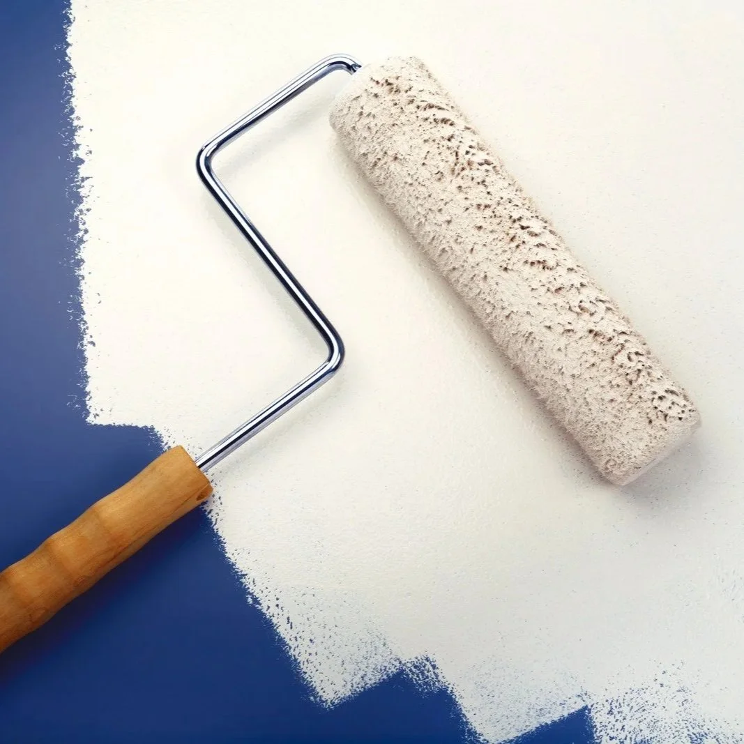
Paint roller applying bright white wall paint, comparing Benjamin Moore Simply White and Sherwin-Williams Pure White finishes for Tampa interiors.
I get this question every couple of weeks from homeowners looking for a cleaner white than the warm-cream options. They've ruled out Alabaster and White Dove because they want something brighter. Now they're stuck between Benjamin Moore Simply White and Sherwin-Williams Pure White — two of the most popular near-true-whites on the market. The two colors look almost identical in the showroom. On a Tampa Bay wall, under Florida sun, they don't.
I'm Mark Savino. I've been painting houses across Tampa Bay for more than 25 years. We've put Simply White and Pure White on hundreds of walls — Carrollwood new builds, Hyde Park bungalows, Belleair coastal homes, Westchase open-plan modern interiors. They behave very differently, and the wrong pick in the wrong room makes the whole house look slightly off.
The Short Answer
For most Tampa Bay homes — especially newer open-plan builds with mixed lighting and cool-to-neutral finishes — Pure White is the safer all-rounder. Its slight gray softness keeps it stable under Florida's intense warm light, and it pairs cleanly with both cool and warm palettes.
For Tampa homes with warm wood floors, brass fixtures, traditional or coastal-cottage styling, or rooms that need warming up — Simply White earns its place. The yellow undertone reads as inviting in those settings, but in strong west-facing afternoon sun, expect Simply White to drift visibly creamy.
If you want a single recommendation across most jobs: Pure White on walls and trim, with Simply White held in reserve for specific rooms or applications that need the warmer pop.
Why Both Colors Sit Above the Off-Whites
Simply White and Pure White aren't warm whites like Alabaster or White Dove — they're a step brighter, cleaner, closer to "true white." That's why homeowners reach for them when the cream whites feel too dated or too yellow. Both colors are designed to read as fresh, modern, and clean, but each manufacturer engineered the formulation slightly differently:
Simply White sits at LRV ~92, with a subtle yellow undertone. It's the brighter of the two.
Pure White sits at LRV ~84, with a slight gray softness. It's a touch warmer in feel but more neutral in undertone.
The 8-point LRV gap is visible on a wall. Simply White is the brighter, snappier white; Pure White is the softer, more balanced one. The difference matters in Florida light, where Simply White's brightness can read almost stark in glare while Pure White stays in its lane.
The Data, Side-by-Side
| Spec | BM Simply White (OC-117 / 2143-70) | SW Pure White (SW 7005) |
|---|---|---|
| Color family | Off-White Collection (warm) | Designer Color Collection / White |
| LRV (Light Reflectance Value) | ~92 | ~84 |
| Hex (approximate) | #F6F6ED | #EDECE6 |
| RGB (approximate) | 246, 246, 237 | 237, 236, 230 |
| Primary undertone | Subtle yellow / soft warm | Neutral with very slight warm + gray softness |
| Brightness on the wall | Very bright, light-bouncing | Bright but slightly softer |
| In south Florida sun | Drifts visibly creamy in warm light | Stays more stable, holds neutral |
| In north light | Stays cleaner, less yellow | Cools slightly but reads consistent |
| Best for | Trim against warm walls, ceilings, warm-palette cabinets, traditional/coastal interiors | Whole-home walls, trim across any palette, modern/transitional cabinets, mixed lighting |
| Pairs cleanly with | Warm woods, brass, cream stone, traditional palette | Both warm and cool palettes, white quartz, cool gray flooring |
| Notable | BM 2016 Color of the Year; OC-117 and 2143-70 are the same color, listed in two collections | SW's most-used "neutral white" — broad designer adoption |
A note on the naming: Benjamin Moore lists Simply White under two different codes — OC-117 (Off-White Collection) and 2143-70 (Color Preview Collection). They're the same formula. You can order at the counter with either code. The OC-117 code is more commonly cited and is what BM tagged for their 2016 Color of the Year designation.
Where Pure White Earns the Spot
Open-plan whole-home walls. This is the strongest case for Pure White in Tampa. Most newer builds — Carrollwood, Westchase, Lutz, Wesley Chapel, Riverview — have an open kitchen-living-dining flow with mixed exposures. Pure White stays consistent across south-facing great rooms, north-facing kitchens, and west-facing slider walls. Simply White shifts noticeably — bright and creamy in the south room, brighter and cooler in the north. On an open plan, consistency wins.
Trim across any wall color. Pure White is one of the most popular trim colors for a reason. It pairs cleanly with warm wall colors (it holds its neutral) and cool wall colors (it doesn't drift creamy). For trim against Agreeable Gray, Repose Gray, BM Gray Owl, or any greige — Pure White is the safer choice. Simply White can read too warm against cool wall colors.
Modern transitional kitchens and bathrooms. Cabinets in Pure White read cleaner against white quartz countertops, stainless steel appliances, or cool gray tile. Simply White cabinets against the same backdrop can read slightly cream by comparison.
Mixed lighting conditions. Tampa Bay homes have a mix of LED, incandescent, and natural light through the day. Pure White handles the mix better than Simply White — its slight gray softness absorbs warm afternoon light without amplifying it. Simply White amplifies warm light into visible cream.
Ceilings. When you want a clean white ceiling that recedes but doesn't grab attention, Pure White is the workhorse. Simply White ceilings are sometimes too bright — they call the eye upward.
Where Simply White Earns Its Place
Trim against warm wall colors. Simply White trim against Agreeable Gray walls, Alabaster walls, or warm beige walls reads as a clean pop. The yellow undertone matches the warm palette and provides crisp contrast. Pure White can read slightly cool in the same context.
Warm-palette kitchens. Cabinets in Simply White, paired with warm wood floors, brass hardware, and cream stone counters — the traditional or transitional Tampa kitchen aesthetic. Pure White cabinets in the same room can read slightly disconnected.
Coastal cottage and farmhouse interiors. Older homes in Tampa Heights, Hyde Park, and the coastal towns benefit from Simply White's warm brightness. White walls that aren't too clinical, with enough warmth to feel lived-in.
North-facing rooms needing brightness. Simply White's high LRV (~92) and warm undertone work well in north-facing rooms, where Pure White can read slightly cool. The yellow gives the room a touch of warmth without going too cream.
Ceilings where maximum light bounce matters. A north-facing bathroom, a low-ceilinged guest room — Simply White ceilings bounce more light than Pure White ceilings. The LRV difference is real here.
What Each One Gets Wrong
Simply White's weaknesses. Strong south or west-facing Florida sun amplifies the yellow undertone into visible cream. In a sunroom or great room with afternoon sun, Simply White can read distinctly golden — flattering if you wanted that, frustrating if you didn't. Cool floors, cool tile, or cool LED lighting fight the warmth — Simply White against cool gray flooring reads disconnected. And on Florida exteriors under intense direct sun, Simply White can read almost pure white, losing the warm character that made the homeowner pick it.
Pure White's weaknesses. In a heavily warm-palette home with traditional finishes, Pure White can read slightly cool or institutional. It's not creamy enough to harmonize with a cream-heavy aesthetic. Some homeowners find Pure White on walls slightly too clinical — they wanted softness and got crispness. In rooms with weak indirect light, Pure White can read flat. And against warm yellow incandescent fixtures, Pure White can pick up a faint cool note.
Neither is perfect. Both are excellent at the right job.
Two Things Most Comparisons Skip
These two whites read very differently from how they look on the chip. Most homeowners pull the swatches at the store, compare them on a white counter, and decide they look almost identical. They aren't. In real light, on a wall, the 8-point LRV gap and the undertone difference create a real visual distinction. Trust what you see on the actual wall, not what you saw on the swatch.
Simply White can appear warmer than its undertone suggests due to its LRV.The high LRV (~92) means Simply White is reflecting a LOT of light back. When that light is warm Florida afternoon sun, the reflection amplifies the warmth. The yellow undertone alone is subtle, but combined with the brightness, the color reads more clearly cream than the chip suggests. Pure White's lower LRV (~84) absorbs more light, which is part of why it stays more neutral under the same conditions.
The Florida Factor
Florida sun does specific things to brighter whites that don't matter as much in cloudier climates.
The Tampa Sun amplifies warm undertones in high-LRV whites. Simply White's ~92 LRV plus its yellow undertone plus direct Florida sun equals a color that can read distinctly cream in south- and west-facing rooms at midday and afternoon. Pure White's lower LRV plus its more neutral undertone holds steadier. For a south-facing Tampa great room, Pure White is the lower-risk pick if you want consistent neutral.
Florida's "blinding white" problem. Very bright whites under intense Tampa sun can read almost glare-white — uncomfortable in a sunroom or poolside room. Both Simply White and Pure White are at risk; Simply White is slightly more so due to its higher LRV. For sun-blasted rooms, consider going one step warmer (Alabaster, White Dove) or pairing the white with a deeper accent color to break up the glare.
Pool cage and water reflection. Screened pool enclosures and pool water bounce filtered cool-tinted light into great rooms. Pure White absorbs this cleanly; Simply White's warmth gets pulled slightly cooler by the bounce. The shift is small, but it can create visual tension if the room reads warm in morning sun and cooler in late afternoon pool reflection.
Trim under Florida light reads differently from walls under Florida light. Pure White or Simply White on trim against a colored wall holds up well — the contrast is the point, and the undertone in the white doesn't dominate. On walls, both whites are more vulnerable to the light-shift behavior. If you're using either as wall color, sample more carefully than if you're using it on trim.
The exterior reads almost identical. Under direct Florida exterior sun, both Pure White and Simply White read almost the same — close to a plain bright white. For exterior trim, the undertone difference disappears in the glare. For the interior, the difference is real.
When the Customer Asks Me Which to Buy
Here's how the conversation usually goes.
If a homeowner in Carrollwood is repainting an open-plan home with white-oak LVP, cool gray porcelain tile, white shaker cabinets, and stainless steel appliances — we're recommending Pure White on walls and trim. Consistency across the open plan holds neutral under mixed light and pairs cleanly with the cool finishes.
If a homeowner in Hyde Park has a 1920s bungalow with original hardwood floors, brass fixtures, and a coastal-cottage aesthetic — we're recommending Simply White. The warmth matches the home's bones; the brightness keeps it feeling fresh.
If a Westchase homeowner has Agreeable Gray walls already and wants trim that pops — Simply White trim. The warm undertone matches Agreeable Gray's warm undertone, and the LRV gap gives clean contrast.
If a Belleair contemporary home has Repose Gray walls and wants trim that doesn't fight the cool greige — Pure White trim. Cleaner pairing with the cooler wall.
If somebody's repainting cabinets in a traditional warm Tampa kitchen — Simply White. The warm undertone reads as part of the warm palette.
If somebody's repainting cabinets in a modern transitional kitchen with white quartz and cool tile — Pure White. The neutrality keeps the cabinets from going cream against the cool counters.
That's how I actually decide. Both are excellent. The home tells you which one belongs.
What the Data Won't Tell You
I want to be honest about what's behind the recommendations.
LRV values come from manufacturer published figures. Designer reviewers occasionally cite slightly different LRVs for Simply White (some sources list 89.52 instead of 91.7), but the higher figure has stronger support across the designer reviewer community. Sherwin-Williams' Pure White LRV is consistently published at 83.957, rounded to 84.
Benjamin Moore doesn't publish official hex/RGB values on the public OC-117 page. The values for Simply White in this article come from third-party paint-matching databases that mirror the BM chip. For a critical color match, work from the BM chip itself, not a digital hex.
Both formulations have been stable for years, but tinting accuracy varies slightly between stores and batches. For a whole-home application, order all gallons at the same time from the same store and the same base.
The Tampa-specific guidance reflects 25 years of seeing how these two colors behave on Tampa walls, combined with consensus from designer reviewer commentary about the Florida-region light. There isn't a single controlled study comparing them under Tampa Bay conditions specifically.
Frequently Asked Questions
In a strictly modern home with cool flooring, polished chrome, and minimal warm accents — yes, Simply White can read too creamy. Pure White is the better modern pick. For homes with mixed warm-and-cool elements, Simply White can still work if used selectively (trim, cabinets) rather than as wall color.
Pure White has a very slight gray softness in its undertone, but it doesn't read as gray on a wall — it reads as a soft, clean, balanced white. If a homeowner wants no gray at all, look at SW High Reflective White or BM Chantilly Lace for a cleaner, true-white option.
Yes — same Benjamin Moore formulation, listed in two different collections. OC-117 is the Off-White Collection code; 2143-70 is the Color Preview code. You can order at the counter with either code and get the same paint.
Depends on the wall color. Pure White trim works with both warm and cool wall colors and is the more universal pick. Simply White trim is better against warm wall colors (Agreeable Gray, Alabaster), where the matching warm undertone creates harmony. Simply White against cool walls can read slightly off.
Both are formulations — the actual paint product determines yellowing. Alkyd-based paints will yellow over the years on whites; 100% acrylic paints hold longer. For trim and cabinets, use 100% acrylic enamel (Emerald Urethane, Cabinet Coat) if long-term white retention matters.
Yes — both SW and BM sell peel-and-stick samples. Better: buy sample pints and paint two-foot squares on the actual wall at 9 AM, 1 PM, and 8 PM. Both whites shift noticeably across Tampa light throughout the day.
Both are warm whites, but White Dove is creamier with a grayed-yellow undertone — softer, more "lived-in" feel. Simply White is brighter with a cleaner yellow undertone. White Dove is the safer warm-white workhorse for trim; Simply White is brighter and works in different applications.
Pure White is closer to a true neutral white; Alabaster is much warmer with a clear cream undertone. They're not in the same color family — Pure White is for clean modern looks; Alabaster is for warm farmhouse-traditional aesthetics.
If you're trying to choose between Simply White and Pure White for a Tampa Bay home and want a second opinion from someone who's actually rolled both onto walls in your neighborhood, give us a call at (813) 831-5433 or request a free in-home estimate. I'll walk the rooms, evaluate the light, check the existing palette, and recommend the white that actually fits your home.