Sherwin-Williams Repose Gray vs Agreeable Gray: A Tampa Painter's Take After 25 Years
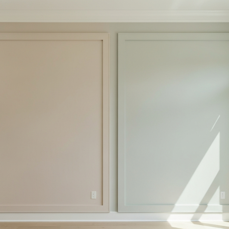
Sherwin-Williams Repose Gray and Agreeable Gray wall colors compared side by side inside a bright modern Tampa Bay living room.
I get this question every time someone falls down the Sherwin-Williams greige rabbit hole. They've looked at 20 colors, narrowed it to 2 — Repose Gray (SW 7015) and Agreeable Gray (SW 7029), and they can't tell which to pick. On the chip in the store, they look almost identical. On a Tampa Bay wall, they behave very differently. The choice between them is one of the most consequential paint decisions a homeowner can make for a whole-home repaint.
I'm Mark Savino. I've been painting houses across Tampa Bay for more than 25 years. My crews have rolled Repose Gray onto sun-flooded primary bathrooms in Belleair and Repose Gray onto north-facing bedrooms that turned lavender by the second coat. We've put Agreeable Gray on whole-home open-plan repaints in Carrollwood and Westchase that the homeowners still love five years later. Here's the actual difference, and how to pick.
The Short Answer
These two colors are closer than the chip suggests on lightness — LRV 60 (Agreeable) vs 58 (Repose) — but they sit in different undertone families. Agreeable Gray is warm greige; Repose Gray is cool greige with violet-blue tendencies in low light.
For a typical Tampa Bay open-plan home, Agreeable Gray is the safer, more predictable pick. It stays in the warm-neutral lane from morning to golden hour and doesn't shift hue families.
For specific bright rooms where a cooler, true-gray feel is wanted — a sun-filled primary bath, a south-facing study, a master bedroom with strong morning light — Repose Gray earns its place. But putting it across an open plan with mixed exposures is a risk; the violet shifts in the shaded zones.
The chip looks similar. The walls won't.
Why Both Colors Are So Popular
Both colors hit Sherwin-Williams' "100 most-popular greige" lists every year. There's a reason. They're both light enough to brighten a room without being stark white. They both work as whole-home neutrals. They both pair with the warm wood-look LVP and tile that dominate Tampa Bay builds. And they both photograph beautifully on a Pinterest board.
The difference shows up on the wall, and specifically in how each one behaves when the light changes. That's the part the chip doesn't tell you.
The Data, Side-by-Side
Here's the spec comparison. These are manufacturer numbers, not opinion.
| Spec | SW Agreeable Gray (SW 7029) | SW Repose Gray (SW 7015) |
|---|---|---|
| Color family | Neutral greige | Neutral greige |
| LRV (Light Reflectance Value) | ~60 | ~58 |
| Hex (approximate) | #D1CBC1 | #CCC9C0 |
| RGB (approximate) | 209, 203, 193 | 204, 201, 192 |
| Primary undertone | Warm tan / soft beige | Cool gray, with violet-blue secondary |
| Light stability | Consistent across day; stays in warm-neutral lane | Chameleon — shifts between warm and cool with light |
| Reads in south light | Warm greige, beige forward | Cooler gray, can read airy and soft |
| Reads in north light | Cools slightly; can read muddy in weak light | Violet-blue comes forward; can read lavender |
| Reads under exterior Florida sun | Reads almost white | Reads even paler, soft warm white |
| Best with | Warm wood floors, cream trim, warm tile, traditional palette | Cool floors, crisp white trim, blacks, navy, spa-like palette |
The LRV difference between 60 and 58 is barely perceptible on a wall — both colors will read as "light greige" to the eye. The real fork is the undertone direction, not the lightness. That's what changes how the room feels.
Where Agreeable Gray Earns the Spot
Open floor plans in newer Tampa Bay homes. This is the strongest case. Most Carrollwood, Westchase, Lutz, Wesley Chapel, and Riverview builds have an open kitchen-living-dining flow with mixed exposures — south windows in the great room, north windows in the kitchen, west slider to the lanai. Agreeable Gray reads consistently across all those zones. Repose Gray shifts noticeably — warm in the south corner, cooler in the kitchen, sometimes violet-leaning by the slider in late afternoon. Homeowners read that shift as "the paint isn't matching" rather than "the color is doing what it does."
Warm wood and warm tile pairings. Tampa predominantly uses warm wood-look LVP, travertine, and beige-toned tile. Agreeable Gray's warm tan undertone harmonizes with all of them. Repose Gray's cool gray base fights warm flooring — it can read disconnected, as the walls and floor belong to different houses.
Whole-home applications. If a homeowner wants one color across the entire house, Agreeable Gray is the lower-risk pick. Its consistency across light conditions means it looks the same in every room, which most homeowners want from a whole-home neutral.
Forever-home selections where resale matters. Agreeable Gray reads as "fresh and current, not trendy" to buyers. Repose Gray has more personality, which means more potential to clash with a buyer's furniture. For homes you might sell within seven years, Agreeable Gray is the safer call.
Light-starved rooms. The slightly higher LRV (60 vs 58) gives marginal additional reflectance, useful in north-facing bedrooms or interior bathrooms with no windows. The bigger win, though, is that Agreeable Gray doesn't pick up unwanted blue-violet in those rooms the way Repose does.
Where Repose Gray Earns Its Place
Bright sun-flooded specific rooms. Repose Gray's cool greige comes alive in strong south or west light. A primary bathroom with a south-facing window, a study with strong morning sun, a primary bedroom with a wall of east windows — Repose reads as a clean, airy, calming gray in those rooms. It's where the color is designed to shine.
Modern or contemporary interiors. Homes with cool gray tile, black hardware, polished chrome fixtures, white quartz countertops, and crisp white trim are designed around a cool palette. Repose Gray belongs there. Agreeable Gray would fight the cool tones.
Spa-like bathrooms and bedrooms. When the design intent is calm, cool, restful — think a Belleair primary suite with marble accents and white cabinetry — Repose Gray delivers the mood. Agreeable Gray would warm the room when the homeowner wanted it cooler.
Pairing with cool floors. Tampa builds occasionally use cool gray tile or polished concrete in modern designs. Repose Gray pairs cleanly. Agreeable Gray would feel off.
Single-room applications. Repose Gray is at its best when applied to one room with the right light, not across an open plan. A homeowner who picks a Repose room and an Agreeable Gray rest-of-house has often made the right call for their home.
What Each One Gets Wrong
Agreeable Gray's weaknesses. In very weak indirect light — a north hallway, a bathroom with no window — it can read flat or slightly muddy. Some designer reviewers note a faint violet whisper in cool light, though it's much milder than Repose. And because it's the "safe" choice, some homeowners find it underwhelming once it's on the walls — they wanted depth and got polite beige-gray.
Repose Gray's weaknesses. The violet-blue shift in low light is the well-documented issue. Houzz forum threads, Kylie M Interiors, and multiple designer reviewers all warn about it. North-facing rooms with weak light turn lavender. Open plans where part of the space is shaded show the shift across the same wall. And on Florida exteriors under intense direct sun, Repose Gray can read almost white — too pale for most exterior applications where homeowners wanted a real gray.
These aren't fatal. They're predictable behaviors to plan around.
Two Things Most Comparisons Skip
The "LRV barely matters here, undertone is everything" point. Color blogs spend most of their words on LRV. Between these two specific colors, the LRV difference is so small you won't see it. What you'll see is the undertone behavior — warm-stable Agreeable Gray vs cool-shifting Repose Gray. Stop comparing the LRV numbers; compare how each undertone behaves in your specific rooms.
Sample on the actual wall in three lighting conditions before you commit. This sounds obvious. Homeowners skip it. Get sample-size pints of both. Paint two-foot squares on the actual wall — not on white poster board, not on the back of a cabinet door, on the wall. Look at them at 9 AM, 1 PM, and 8 PM with the lamps on. If Repose shifts dramatically in a room you'll be living in, you've got your answer. We do this on every job where the customer is wavering. Fifteen dollars in sample paint saves a thousand dollars in regret.
The Florida Factor
Florida light does specific things to these two colors. Knowing them helps the decision.
The Florida sun amplifies undertones. Strong direct light pushes the warm side of Agreeable Gray further beige; it pushes the cool side of Repose further blue-violet in shadow and washes Repose toward white in direct sun. On Florida exteriors, both colors read almost white — too washed out for body color, fine for trim against a darker accent.
Pool-cage light bounces into the great room. Tampa Bay homes with screened pool enclosures get filtered light bouncing through the slider all day. That light has a slight blue-green cast from pool water and screen mesh. Repose Gray picks this up — the cool undertone intensifies. Agreeable Gray neutralizes it. For homes with strong pool-side light, Agreeable Gray is the safer call across the open plan, with Repose reserved for rooms away from the poolside.
Tile-to-wood transitions get tricky. Many Tampa builds mix tile entry, LVP main living, carpet bedrooms. Agreeable Gray bridges these transitions cleanly because it's warm-neutral. Repose Gray can read disconnected at the transition — fine on cool tile, slightly off against warm LVP.
Florida afternoon golden hour exaggerates warm undertones. From 4 PM to sunset, Tampa light turns golden. Agreeable Gray warms beautifully in this light — many homeowners say it looks best then. Repose Gray fights the golden light slightly; its cool base tries to stay cool while the room warms around it. Not a problem, but a visual tension worth knowing.
When the Customer Asks Me Which to Buy
Here's how the conversation usually goes during the color walk-through.
If a homeowner in Carrollwood is repainting an open-plan home with wood-look LVP, beige tile in the entry, white shaker cabinets, and mixed light through the day — we're recommending Agreeable Gray. Consistency wins on the open plan.
If the same homeowner has a specific room — say, a primary bath with a south-facing window, white quartz, and chrome hardware — we'll suggest Repose Gray as a feature for that one room only. The rest of the house stays Agreeable.
If somebody in Hyde Park has an older bungalow with cream trim already in place and warm hardwood floors — we're recommending Agreeable Gray for the whole house. The warm undertone harmonizes with what's already there.
If somebody in Belleair has a contemporary build with polished concrete, black hardware, white oak cabinets, and cool gray tile — we're considering Repose Gray. The modern cool palette is what Repose was made for.
If a homeowner can't decide and the home has mixed exposures across the open plan — Agreeable Gray, every time. Lower risk, fewer surprises.
That's not me hedging. That's how the colors actually behave in real Tampa rooms.
What the Data Won't Tell You
I want to be honest about what's behind the recommendations.
Sherwin-Williams doesn't publish official undertone descriptors on the consumer color pages. The "warm tan undertone" for Agreeable Gray and "cool with violet secondary" for Repose Gray are characterizations from designer reviewer consensus — Kylie M Interiors, The Color Concierge, Setting For Four, By Design, and Viz — plus 25 years of seeing how each color behaves on Tampa walls. They're not from SW's official documentation.
LRV values are SW's published figures, but some reviewers cite slightly different numbers (58 vs 58.22 for Repose, 60 vs 60.386 for Agreeable). The differences are too small to matter in practice; SW's published chip is canonical.
The "Tampa Bay homeowners prefer Agreeable Gray" framing reflects what I see on jobs and what other Tampa painters report on their public blogs. It's directional, not a quantified statistic.
Both colors are formulations that have stayed stable for years, but tinting accuracy varies slightly batch to batch and between stores. For a critical color match across a whole house, always order all gallons at the same time from the same store and the same base.
Frequently Asked Questions
Cooler. Agreeable Gray has a warm tan undertone; Repose Gray sits on the cool side of greige with violet-blue secondary notes. The chip-to-chip comparison in the store doesn't always show this; the wall-to-wall comparison does.
In low light or strong cool light, yes — that's the well-documented issue. North-facing rooms, hallways with weak natural light, or rooms with cool fluorescent fixtures will pull the violet-blue forward. In south-facing or warm-light rooms, it stays gray.
You can, but expect the cool shift. If you want gray without the lavender risk, pick a color with less blue in the undertone — Agreeable Gray, SW Accessible Beige, SW Mindful Gray (deeper), or BM Edgecomb Gray.
Agreeable Gray pairs with warm whites: SW Pure White, SW Alabaster, and BM White Dove. Avoid cool stark whites — the contrast reads off.
Repose Gray pairs with cooler whites: SW Extra White, SW Pure White, and BM Chantilly Lace. Warm cream trim fights it.
Both work better as whole-room colors than accent walls. For an accent, choose a deeper color that contrasts — navy, charcoal, forest green, or a deeper greige (SW Mindful Gray, SW Worldly Gray).
Both read almost white in direct Florida sun on the exterior. They can work as trim against a darker body color. For body color on a Tampa exterior, look at deeper greiges or actual gray tones — SW Anew Gray, SW Mindful Gray, SW Useful Gray.
Based on contractor reports I've seen and our own job mix, Agreeable Gray gets quoted more often for whole-home Tampa repaints. Repose Gray comes up more often for specific bathrooms or modern-leaning homes. Neither is universally "the Tampa color."
Two — one of each. Paint a two-foot square on the actual wall in the room you're considering. Don't compare in the store. The wall is where the color actually has to work.
Pick Agreeable Gray if you live in a modern Tampa Bay open-plan home with mixed exposures, warm wood-look flooring, and you want one color across the whole house. Lower risk, more forgiving, stays in the warm-neutral lane all day.
Pick Repose Gray if you want a specific room — bright bathroom, sun-filled bedroom, modern study — to feel cooler, calmer, more spa-like. Sample carefully and only use it where strong light keeps the violet-blue from coming forward.
And on every greige decision — sample on the actual wall, in real light, at three times of day, before committing the whole house. The fifteen-dollar sample pint saves the thousand-dollar repaint.
GET IN TOUCH
If you're trying to choose between Repose Gray and Agreeable Gray for a Tampa Bay home and want a second opinion from someone who's actually rolled both onto walls in your neighborhood, give us a call at (813) 831-5433 or request a free in-home estimate. I'll walk the rooms, look at the light, check the existing flooring and trim, and recommend the color that fits your actual house — not the one that looked good on Pinterest.